
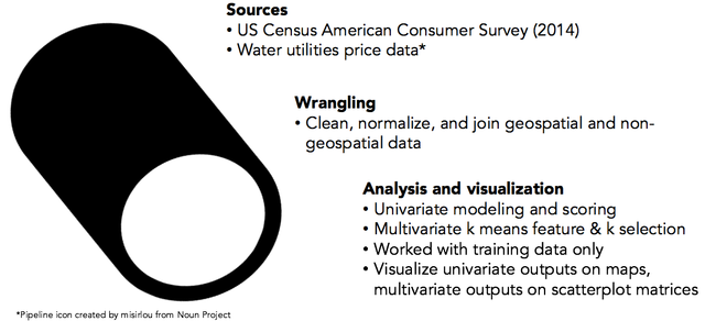
Exploration of water pricing in the US
Water access, affordability, and quality have re-emerged as serious issues in the US and continue to be major problems in developing countries. I wanted to visualize the extent of this issue in the US using water price data and demographic information using clustering algorithms. Check out my repo on github for the code.
Methodology
I used univariate clustering on water usage, price, and income to identify municipalities and regions where water may be less affordable. Then, I performed a multivariate clustiner analysis to see how other factors, including demographic variables, may correlate with income and water usage and price. I obtained my demographic and geospatial data from the 2014 US Census American Consumer Survey (ACS) and price data from Food and Water Watch.
Univariate analysis of water utilities prices
To visualize water utilities pricing clusters, I used the Jenks natural breaks classification method, which seeks to find optimal clusters of along a univariate set of data. Jenks works by minimizing the variance within classes and maximizes the variance between classes. The two maps below each show the same 400 water utilities prices grouped into five price clusters, but the first one uses the Jenks method and the second method splits each group evenly into five clusters. Each color represents a price cluster, and although the both maps may look similar at first glance, the jenks clustering scheme has a larger number of data points within the low price cluster than the quintile clustering scheme. The Jenks method indicates that prices are more concentrated at the lower end of the pricing specturm than the quintile method suggests. In this case, the Jenks method may do a better job showing that there a larger share of water utilities prices are lower. In both cases, higher water prices tend to be found in drought-stricken California and in pockets of the Midwest (including Flint, MI), Appalachia, and the Northeast.
What should we make of the discrepancy between the Jenks and quintile clustering schemes? Which one is better? The answer is that it depends on how you want to segment your data. Quintiles are pre-defined, and can be useful for providing apples-to-apples comparisons across datasets. Jenks breaks, which are data-driven splits, may be more appropriate for doing exploratory analysis to identify natural clusters.
Multivariate analysis
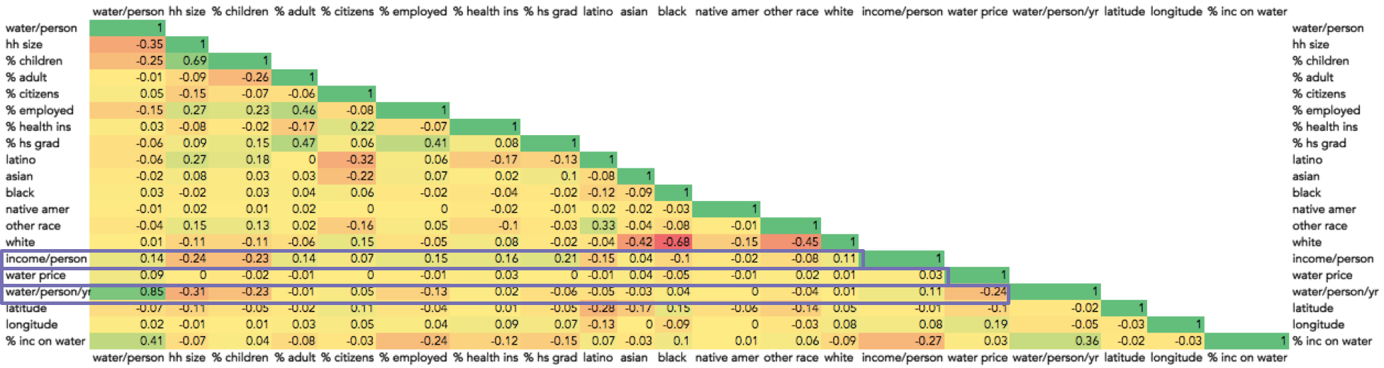
Next, I wanted to see if certain demographics correlated with the univariate clusters. To do this, I conducted a multivariate analysis – k means clustering – that incorporated other data, including education, ethnicity, and income. To get a rough idea of which features to include in this analysis, I created a correlation matrix to assess the relationship between each feature. Values of 1 and -1 show strong positive and negative correlation, respectively (i.e. positive means if one feature increases the other increases and negative means if one feature increases the other decreases). Values near zero mean the two features are not well-correlated.
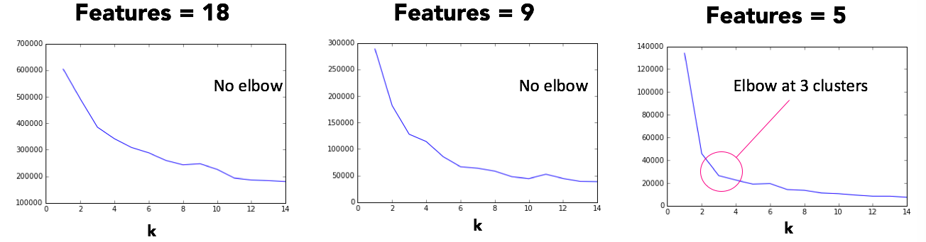
The k represents the number of clusters, and the objective is to find the optimal number of k clusters using only the most relevant features (e.g., water pricing, income, etc.). For this method, it’s vital to remove extraneous features to avoid the curse of dimensionality. It’s also important to select the lowest number of clusters that describe the grouping of the data.
The elbow plots below show how to iterate across feature sets across k clusters that range from 1 to 14. The x axis is the number of clusters k and the y axis values represent the error. The goal is to select the number of features and k clusters that occur at an elbow. I found an elbow - which represents the point at which you start to get diminishing returns for increasing the number of clusters - at 3 clusters and 5 features. Selected features were water usage, income, water price, household size, and
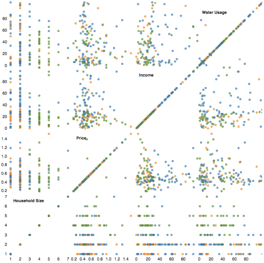
The scatter plot matrix, which is used to visualize higher dimensional data, below shows that the preliminary results of the multivariate analysis were inconclusive. Each color in the matrix represents one of the three clusters, and there are no obvious patterns that can be observed from this visualization.
Conclusions
The univariate results were more intelligible and conclusive than the multivariate ones. Binning techniques like Jenks and quintiles each have their place for univariate binning, although in this case Jenks was more useful for observing natural breaks in the data. To improve the multivariate analysis, more research is needed to identify why the combination of demographic features such as income, employment, and number of children plus water consumption and pricing did not result in intelligible clusters.